Color Theories
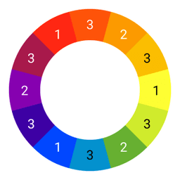
There are different color theories, and colour theories often provide practical guidelines for mixing colors and visual effects of specific color combinations. One of the best known theories is the colour wheel (see Figure 1) containing twelve colors, divided into primary, secondary and tertiary colors. Primary colors (1) are red, yellow, blue and are evenly scattered on the wheel. These primary colors allow you to create new color combinations and that are the secondary colors (2): orange, green and violet. When primary colors are combined with secondary colors, the tertiary colors (3) are created. These are red orange, yellow orange, yellow-green, teal, blue-violet and red-violet.

Color Marketing
Research shows that colour is the main motivator for purchasing a product in more than 90% of consumers. Furthermore, colors determine mood, productivity and even digestion. So we humans are unconsciously influenced by colors. It makes sense that colours are used for many (commercial) purposes and therefore also for proposals. Note that it is crucial to take into account the symbolism and associations that colour evokes. This requires both colour knowledge and understanding of the target audience.
Knowledge of colours
Every colour has a meaning. They are explained each by one below.
Red
The colour red has two different associations: love, but also violence. Cupid's but also the devil's. Red always attracts attention. It is not just that red plays an important role in traffic lights and road signs. In addition, red is the perfect colour for expressing power, passion, energy and importance.
Orange
Orange is a bit softer than red that has no escape. Most people experience positive feelings with orange color. It is soothing and evokes calm, patience, creativity and trust. Orange also symbolizes autumn and change. Finally, orange can also bear the meaning of cheap or affordability.
Yellows
Yellow is a warm, energetic color. It makes people happy. The colour yellow also stands for hope and durability. But beware, it is associated with nervousness, unrest and inexpensive at the same time. So quite a few differences!
Green
Green is a combination of blue and yellow. It can therefore be used for a variety of purposes. A cool colour that's connected to nature. Growth and new beginnings are also associations and, finally, green is calming and healing.
Blue
The meaning of blue depends on the hue: light blue is relaxing, bright blue, on the contrary, refreshing, and dark blue stands for reliable and responsible. Blue is widely used for business purposes.
Purple
Traditionally, purple is considered an elite or luxurious color. Nowadays, it also stands for ingenuity, inspiration and creativity. Purple stimulates fantasy and because purple is shaped by red and blue, it is also necessary to consider the emotions that red and blue can evoke when deploying purple.
Black
Black is one of the neutral colours. Just like red, there are contrasting emotions and feelings. Black is often associated with death and evil. On the other hand, we also see elegance and strength in black. Black creates clarity and is therefore often used as a colour for texts.
White
No doubt about it: white stands for pure, innocence, simplicity and clean. White is also used as in white spaces or paragraphs to create peace and overview.
Grey
Grey is a neutral colour that is often labeled conservative, competent, professional and formal. Grey is often used in business.
Tan
A warm, natural colour associated with earthness, reliability and, in some cases, solid and boring. This means that it can happen to be a little too juicy or bourgeois.
Beige
The meaning of beige depends heavily on the colors around it. It has a quiet character, which makes it often used as a background in addition to white.
Ivory
Ivory is a refined colour created by brown and white. Ivory symbolizes history and because it has a lot of white, it is also associated with purity, tranquility and elegance.
Keep the target audience in mind
In order to respond to the subconscious mind and thus influence emotion and behavior, age, gender and personality should be taken into account regardless of culture.
Age
The older the target audience is, the darker they see things. Therefore, they will find lighter colors more attractive.
Personality
Everyone has a different personality and therefore different preferences when it comes to colours. Are there a lot of extroverts in a target audience? Then choose eye-catching and light colours.
Gender
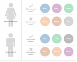
Men come from Mars, women come from Venus. This is the title of John Gray's book that has sold millions of copies worldwide since its release. Also, in terms of associations and emotions that evoke colors, men and women differ considerably. In the image of KissMetrics (see Figure 2), the differences are clearly visible, women love blue, purple and green, while men prefer blue, green and black.

Apply Color Psychology in Proposals
When you have sufficient knowledge and insight, the psychological influence of colours can be applied perfectly in proposals, if strategically incorporated. Especially with digital proposals, the possibilities are almost limitless. Obviously, it should not become cacaphonia, but some options are listed below.
Apply color psychology to:
- the cover of a proposal
- pictures
- background colors
- typefaces
- titles, spacers and white spaces
- graphs, infographics, and tables
- hyperlinks
- call to action buttons]
Discover the color possibilities of a proposal editor to achieve consistent branding.